Giving A Book the Cover it Deserves?
Reflections on a Beloved Novel & the Architecture of Book Discovery
"DON’T JUDGE A BOOK BY ITS COVER” has admonished us against assessing a person’s value by their outward appearance seemingly since birth. (So ingrained, you’d think it was the 11th Commandment.) “Book covers aren’t created to explain the book,” notes celebrated designer, Chip Kidd. Rather, they should “get you to open the book and start to read and investigate it,” which (ironically) means book covers can be judged on their own merits—while still spurring us to arrive at a few judgements: About the book’s popularity (if it’s A New York Times Bestseller); About its purported mass appeal (via endorsements of Oprah’s and Reese’s Book Clubs, and Barrack Obama’s annual list); or whether it meets a certain standard of excellence (Winner of the Pulitzer Prize or A Booker Prize Finalist).

Love it or hate it, the first-edition cover of A Little Life (left) is hard to ignore, while the follow-up cover is so boringly unobjectionable as to seem almost purposely so.
While these endorsements provide social proof and can make a book seem like a must-read, it’s the overall cover design—the “Architecture of Book Discovery” (combining color, type and imagery)—that does the heavy lifting. That draws our eyes across a bookstore’s floor to a shelf or table. That says, “I’m the book you never knew you wanted.” Sometimes, these are “meet cute” moments that result in a great read. And on rare occasions, we’re introduced to a book that will become life-changing. One we’ll endlessly reference and recommend, while its most affecting lines seep into our everyday vocabulary.
I was reminded of that sense of discovery when a video of a woman (@booksbykayb) tearing the cover off of A Little Life (2015) stopped me in my Instagram tracks. A fabricator of elegant, bespoke book covers, she couldn’t stop thinking about Hanya Yanagihar’s novel, the post read, and “Wanted dark and moody but could not think of graphics that would do it justice… So, [she] let the fabric set the mood.” Compelled to comment on her post (something I rarely do), I find myself exploring the pull of book designs further here.

@booksbykayb’s Instagram video shows the custom bookbinder giving A Little Life the new fabric-and-gold-foil cover “it deserves.”
My Comment: While I think your love of reading—and of this novel specifically—is great, I had to jump in and question your “giving this book the cover it deserves.” I’ve read A Little Life three times (and was left feeling both bereft and hopeful in ways no other novel ever had). After gifting six hard copies to friends—including my own, I was frustrated to see that the reprint no longer featured Peter Hujar's arresting, ambiguous image on the front. It was an image that author, Hanya Yanagihar fought for: “I really hung on for the cover,” she said. “I love the intimacy, the emotion, what looks like anguish. There’s something so visceral about it.” I agree 100%! In the online bookstore era, we rarely have the experience of a physical book calling to us from a random shelf. But A Little Life’s cover did just that to me. And it remains as affecting as the painful and profound story within.
GOOGLE “A LITTLE LIFE COVER” and it’s clear that readers are as emotionally divided around Peter Hujar's photograph (titled “Orgasmic Man”) as they are the novel, itself. “One of the categories in a reading challenge I'm doing is ‘Read a book with a cover you hate,’” said one woman. “And this was the only one that sprang to mind.” While another swears she, “Always thinks [of] Jim Carrey when seeing this book in the bookstore.” The story of four friends that move to New York after college centers around a talented litigator, Jude, whose mind and body are scarred by relentless sexual abuse, self harm, and childhood trauma. For author Yanagihar, it’s the “uncertainty of the image… that makes it so alluring”—and the perfect “snapshot” of her novel. “The pendulum swinging between ‘ecstasy or agony’ with viewers unclear as to whether they are ‘witnessing or trespassing’.”
Admittedly protective of the book (and my connection to it), I was wary about seeing director Ivo van Hove’s 2018 theatrical adaptation at BAM. It was described by one reviewer as, “A theatrical pileup of suffering and woe that is beautifully acted but surpassingly bleak, and spectators may find their own threshold for trauma tested more than once. So bleak, that the play’s website came with an elaborate content warning and the offer of ‘post-show support resources.’” Reading that the director used video projections to underscore Jude’s internal struggles was what finally kept me home. For me, Hujar's cover image was all the visualization I needed.
“There are two ways to give a good first impression: with clarity and with mystery.”


“THE ARCHITECTURE OF BOOK DISCOVERY” includes a variety of visual storytelling tools that can pique curiosity and engage potential readers. While certain genres rarely stray from an established visual language (think Romance novels), the last 20+ years have been a golden age of inspired book design. And A Little Life is among dozens of favorite books about which I knew nothing when first seeing them in-store, including (above): Kissing in Manhattan (David Schickler, 2002), A Wolf at the Table (Augusten Burroughs, 2008), and Barrel Fever (1995)—published when David Sedaris was not yet the celebrated wit whose books now sell themselves.

1. Color Psychology plays a significant role in how we perceive and choose books. Historical fiction favors earthy browns and golds to reflect the past; and the red-and-black combo so often seen on thrillers conveys suspense and seriousness. While it’s the contradiction between neon colors and my notions of a “Deacon” that drew me to Deacon King Kong (James McBride, 2020), designer Jaya Miceli chose the vibrant colors (above) to capture the tumultuous 60s and 70s in which the novel takes place.
2. Typography extends far beyond using serif fonts to suggest an historical novel and whimsical fonts to indicate humor (or a children’s book). Helen Yentus’ design for Eat, Pray, Love (Elizabeth Gilbert, 2007) is one of the most iconically literal typographic covers ever. While Chip Kidd diffused the ink of his title for Augusten Burroughs' memoir Dry (2013, shown above) in water to create a paradoxical effect “to deceive the reader, leaving a sense of hopeless despondence and denial often associated with alcoholics.” Interestingly, Emily Mahon’s design for The Longest Way to Eat a Melon (2025) played with the spacing of the title text (below) to “break up its length and tee up the nonlinear nature of the stories that follow.”
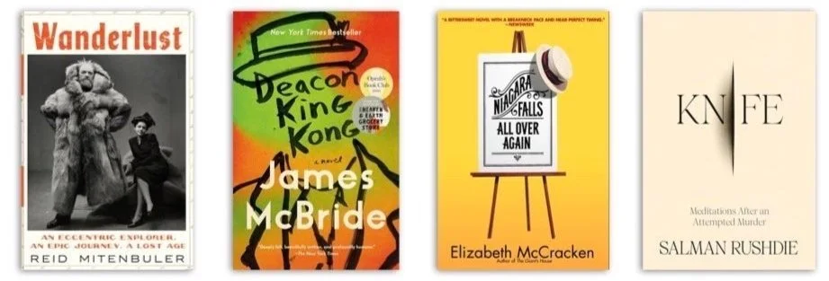
3. Imagery that hints at the story before the story begins has drawn me to The Dinner (Herman Koch, 2013) and Niagara Falls All Over Again (Elizabeth McCracken, 2002). It was Joe Holland’s illustration of a fedora-clad man standing before a crumbled brownstone that lured me into buying my first Gay Talese book, Bartleby and Me (2023). And two hats that made me pick up Andrew Sean Greer’s The Confessions of Max Tivoli (2005). That book is one of my all-time favorites—the sepia cover suggestive of its historical backdrop of San Francisco at the turn of the twentieth century; the two hats hinting at the story of a man born with the body of an eighty-year-old that grows younger as he gets older—so that each successive time he finds his love Alice, she does not recognize him.
Who wouldn’t pause at Irving Penn’s 1947 portrait (above) of polar explorer Peter Freuchen and his Vogue illustrator wife, Dagmar Cohn on the cover of Wanderlust (Reid Mitenbuler, 2024). It’s the rare memoir cover that is as artfully reductive as Salman Rushdie’s Knife (2024). And the rare celebrity tome that goes beyond the traditional glamour shot. So kudos to Scandal alum, Kerry Washington, who commissioned artist Reisha Perlmutter’s oil-on-linen portrait for her memoir (showing the actress’ underwater reflection, above) after realizing how fundamental water and swimming had been in her life.

Examples of the current juxtaposition trend that mixes “fun” typography with “academic”, centuries-old paintings.
4. Graphic trends and crazes have included exploding flowers, the backs of women’s heads, and an excess of flames on jackets, The New York Times reported in April. While the latter was meant to telegraph “volatility” or “unexpected danger,” it was the 2020 cover (above) of Kevin Williams’ Nothing to See Here, whose plot actually DOES revolve around two young children randomly bursting into flames, that grabbed my interest and wallet.
Today, it’s all about iridescent neon or handwritten type over “centuries-old genteel paintings," The New York Times continued. A trend that Thomas Haggerty at Bridgeman Images (which licenses paintings for commercial use) chalks up to “the power of juxtaposition.” The cover of Miranda July’s All Fours (right, 2024) exemplifies the trend. It’s one of the best books I’ve read this year—but one I would have walked by (no matter how many copies were on display). It was the book’s appearance on numerous critics’ “Best Of” lists that piqued my interest. And having finished the book, I can make no connection between its bucolic cover and the story of a forty-five-year-old female artist who leaves her husband and child at home to take a cross-country road trip—only to check into a motel 30 minutes later and experience a boldly sexual reawakening.
5. Author Branding employs a recognizable design style that fans can instantly identify and is most common among writers of mysteries and legal thrillers, including James Patterson and Patricia Cornwell.

Publishers trusted in the equity of To Kill a Mockingbird’s original cover (however uninspired), when releasing its 2015 “prequel” (right).
WHILE ALL FOURS IS (IN MY OPINION) an example of where the “tools of discovery” failed, one book stands out for having purposely ignored them all together. And perhaps it’s the rare book that could: To Kill A Mockingbird’s 2015 prequel, Go Set a Watchman. With 60 million copies sold, Harper Lee’s first novel is one of the most beloved classics of the 20th century (and was voted America's #1 best-loved novel in PBS's “The Great American Read”). And “Watchman’s” unexpected discovery (decades after it was written) made its publication one of the most highly anticipated in history—with stores staying open all night, and Amazon declaring it their "most pre-ordered book" since the final Harry Potter novel.
There have been relatively few new cover designs for “Mockingbird” in the 65 years since its publication—and almost all reference the original cover’s tree. Go Set a Watchman intentionally mimicked Harper Collins’ 1960 dust jacket, convinced that there was equity in designer Shirley Smith’s original cover (however uninspired). Nowhere does it say “From the Author of “ or “The Prequel to.” And nothing in its design would attract a book-buyer who had never seen To Kill a Mockingbird’s cover. Can you think of a more audacious use of “Author Branding?” Michael Connolly has 40+ titles. Harper Lee: two!
“Sometimes with a jacket, what you’re trying to do is essentially brand the book, as you would a corporation. ”
Like To Kill a Mockingbird, there have been few redesigns of Jospeh Heller’s Catch-22 (1965, below)—a defining example of designer Paul Bacon’s “Big Book Look.” “There was a time when book jackets had to be filled, top to bottom, with realistic illustration,” Peter Mendelsund told ThinkProgress. Bacon’s great innovation, he argues, was to rearrange the hierarchy of the book jacket (in Catch 22’s case, a large, bold title, prominent author’s name, and small conceptual image.) Many credit Bacon with elevating book cover design to an art. And with introducing the notion of “book branding”— essentially branding the book “as you would a corporation by finding some typographic method or emblematic image that will represent it most simply.” Both Peter Benchley’s Jaws (designed by Paul Bacon, 1975) and Michael Crichton’s Jurassic Park (designed by Chip Kidd, 1990) were so memorable, they became the brand icons for four and seven films respectively (and the driver of millions of dollars in licensed merchandise).
Covers that make every ”Most Iconic” list, ” include Jurassic Park, Jaws, The Godfather (designed by S Neil Fujita, 1971); Catch-22, The Handmaid’s Tale (designed by Fred Marcellino, 1986); and The Unbearable Lightness of Being (designed by Fred Marcellino, 1984).
TO PUBLISHERS, THIS NOTION OF “BRANDING” is more important than ever as attention spans wane—and more and more purchases are made from your phone or laptop. “A good book cover has to look appealing as a thumbnail on Amazon,” one book exec declared on Reddit. No wonder publishers are treating the unveiling of some covers as social media events (as they famously did with Sally Rooney’s 2021 book, Beautiful World, Where Are You). For many, Sally Rooney’s Normal People (2018) was the first “book- cover-as-Instagram-phenomenon.” And one of the first to

Beautiful World, Where Are You’s designer, Jon Gray praises illustrator Manshen Lo’s ability to hint at the humanness of the book’s characters “with just detail and posture. ”Some favorite social media cover finds include Gray’s design for O (Steven Carroll, 2021), with its peeled-back letter suggesting a story behind the story; and Rachel Willey’s Magritte-inspired Outlawed (Anna North, 2021), which deconstructs genre and gender archetypes.
put a designer (in this case, Jon Gray), front and center. Since then, the pressure on designers to really push the boundaries has increased… but so have the honors, with one major British Book Award reinstating the “Designer of the Year” category (after a ten-year absence).
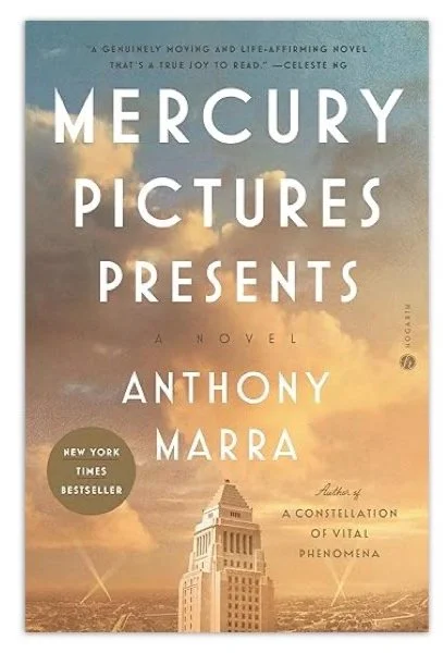
IT’S NUMBING TO ENVISION A DAY when brick-and-mortar bookstores go the way of silent movies—though hardly implausible, considering Amazon’s continued digital dominance. Hearing that the Strand has taken over the Upper West Side space recently vacated by Shakespeare and Co. bolstered me against this looming inevitability. And recently, the Fountain Bookshop appeared like an oasis a mere two blocks from my home in Hudson Heights. I’ve pledged to buy a book a week (both to support local business AND fill my head with something other than toxic political sewage). And Mercury Pictures Presents (whose cover hinted at a klieg-lit era of immigrant movie moguls) came home with me Saturday.
Yes, digital powerhouses like Amazon, Barnesandnoble.com (and others) can make suggestions based on past searches and purchases. Amazon even brought its algorithm to life at its short-lived brick-and-mortar stores—with titles organized on shelves in an “if you bought this, you’ll like this” manner. But nothing beats the in-store surprise of discovery I’ve described.
With the art of book design as alive as ever, watching @booksbykayb’s cover A Little Life in a stuffy floral fabric will never convince me that the cover of a book is no different than the cover of a tissue box. A recent rundown of the top 20 covers of all time—including A Catcher in the Rye (1951), Jaws (1974), Invisible Man (1952), and Song of Solomon (1977)—speaks to the cover’s ability to both capture our imaginations across a crowded bookstore and hold it for decades.
As for future classics, Emily Temple @ lithub.com thinks it’s a “little premature to count anything published in the last 30 years as iconic… including more recent-but-recognizable covers as Conversations with Friends or A Little Life”
But I can certainly try!

The Fountain Bookshop has appeared like an oasis in my neighborhood. 803 W 187th St. between Ft Washington Ave & Pinehurst Ave. FountainBookshop.com, Phone: (646) 438-9218.
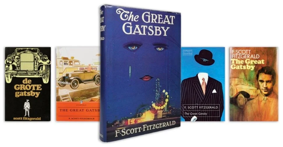
Francis Coradal-Cugat's original cover art for The Great Gatsby is one of the lasting images in literature, but that didn’t prevent the book from fading into oblivion by 1925—OR keep book designers from trying to outdo it in the century that followed.
The iHeart Podcast, “Very Special Episodes” marked the book’s 100th anniversary in April with the surprising story of “How Gatsby Went From Total Flop to Great American Novel.” Click here to listen.